What
Background
Symbility Health is an all-inclusive software solution for insurance carriers to allow their customers to monitor and use their employee benefits. With an outdated app that had been designed in early 2000, some of the biggest challenges were:
- Tedious data entry and lack of accuracy on customer-provided information, resulting in longer processing time.
- High call volume to customer center because of ambiguous information visible to customers.
- White-labeling of the product was a pain. Without a clear strategy on the customizability of the app, everything was hard-coded.
Role
Lead Product Designer
I designed both applications for iOS and Android while working with 12 developers. With extremely tight resources and time, I had to maximize my efficiency to make sure the design doesn't block engineering. Some of the key things I included:
- Initial concepts & rapid prototyping - During the discovery phase, getting validation from stakeholders and users was vital to make sure we are building the right product.
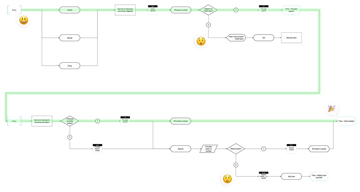
- Detailed IA - I wanted to make sure we capture both happy and un-happy paths upfront to avoid reactionary design during the project.
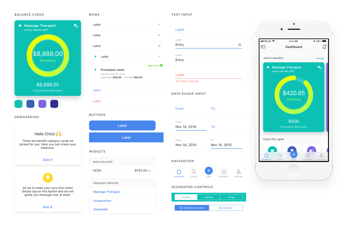
- Component guide - Making sure the design is consistent and predictable to the engineers and to plan out white-labeling of the product.
Approach
User research
We spoke with 15 users and 8 stakeholders to find out how people were using their benefits app and what were some of the pain points. Some of the findings were:
- Filing a claim has become a tedious process that could take quite a while, often leading to mistakes and frustration for all parties involved.
- Accessing information was hard. The majority of customers weren't able to access resources/ info even if the functionality is there.
Empowering users to make the right decisions – As an employee, the user should be able to access his/her benefits information anytime. The information should be clear and accurate, so I know what I am covered for and plan my next visit to a service provider.
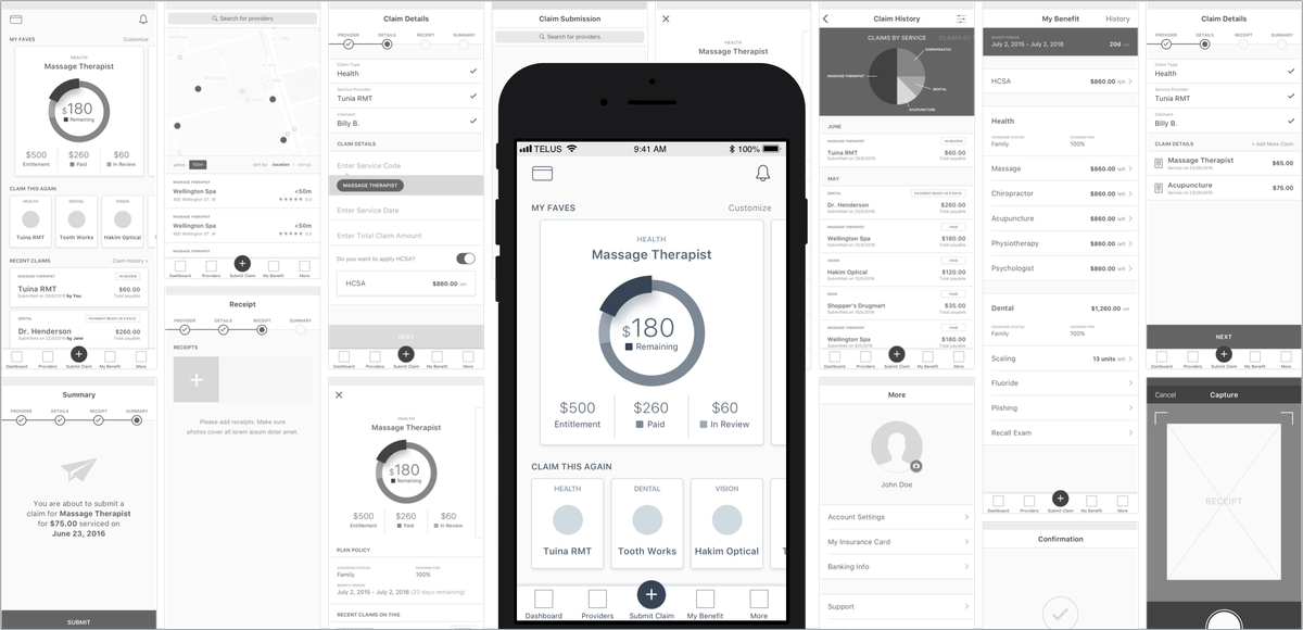
Dashboard
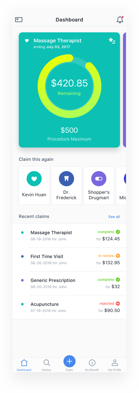
As we were designing a health insurance app that sits in your daily device, we wanted to make sure the information presented is relevant to the user. The first page should always display your most current balance on how much you can spend on each benefit category. Have them a reason to open the app at least once a week to get them informed.
Widgets
The claim details page is where the user input the info from the receipt. Based on our findings, the user is probably entering the same service code he/she did multiple times. I introduced a 'widget' underneath the relevant fields that helps the user to make faster and accurate choices.
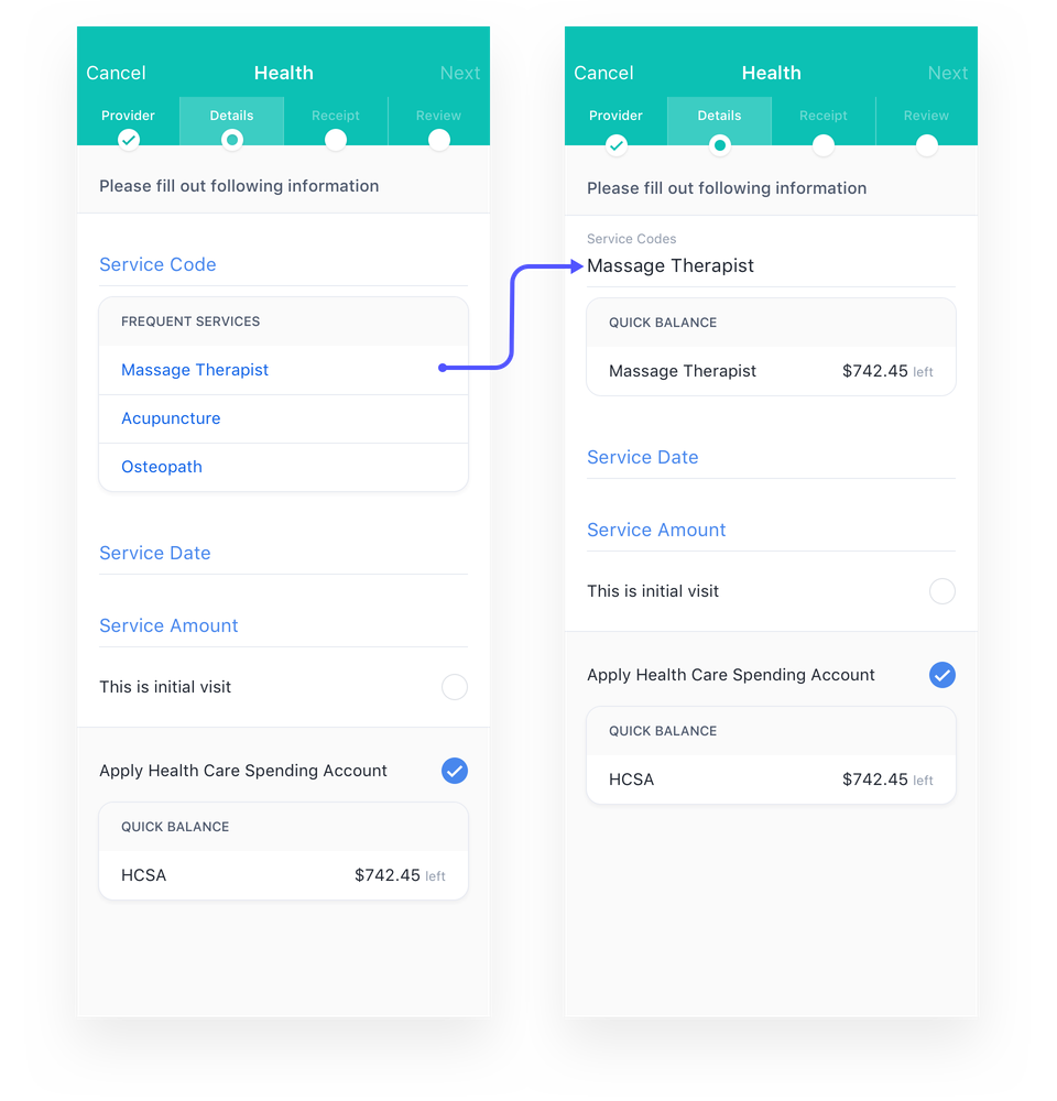
Make it easy for users to enter their info – After a visit to the service provider, the claim submission process should be quick and easy, and I want to get my money reimbursed asap.
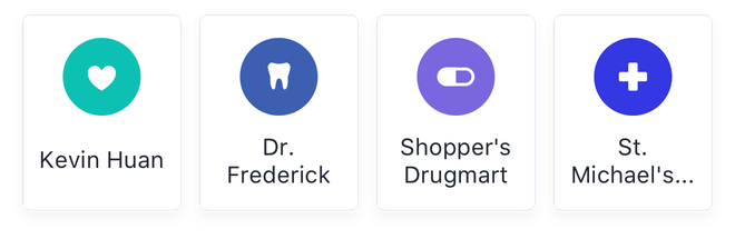
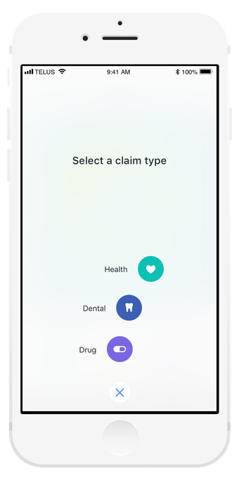
Quick actions
One thing we learned during the research was, users, visit the same providers repeatedly. With this in mind, I wanted to make the submission process a quick and easy step. By introducing 'Claim this again,' actions, returning users can start a claim process within 2 seconds.
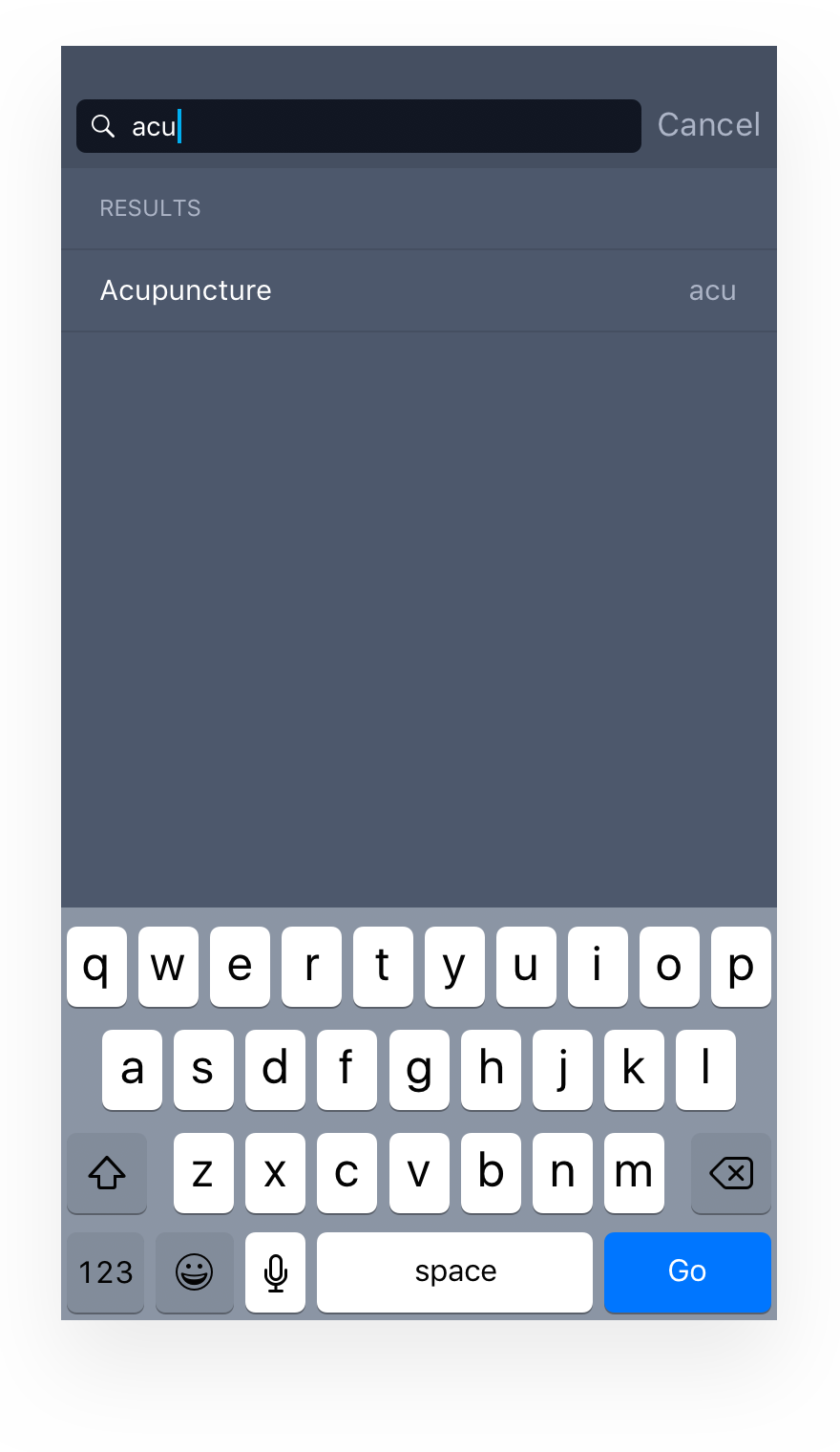
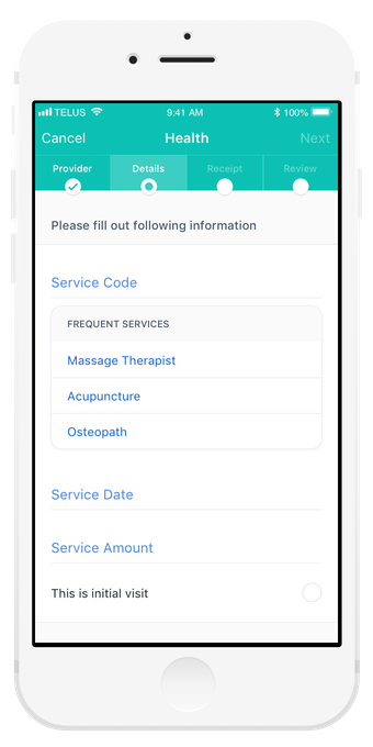
Service code input
For the users who are inputting new service code, the experience could be confusing, often results in inputting wrong procedure codes, and adjudicator on the other end will have to correct it once it gets submitted. A different method of auto-fill was necessary. During a claim process, service codes should exactly match what's in the receipt. However, these codes are sometimes hard to understand on the user's end. As a solution, we mapped these codes to plain English to enable search results to show up regardless of what the user entered.
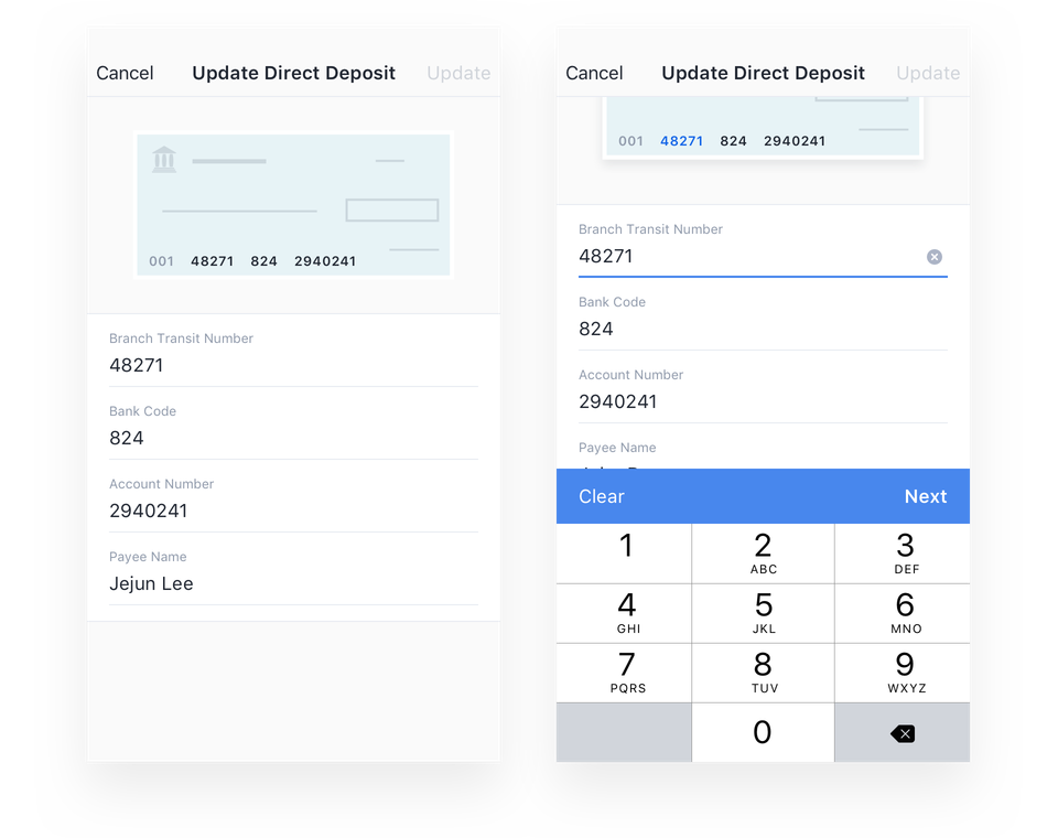
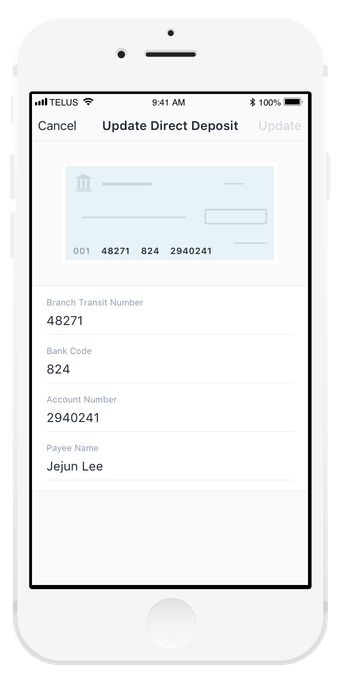
Direct deposit input
For the user to get reimbursed, he/she has to input the information from a void cheque. This traditional experience could get confusing as numbers in the cheque is not always clear for them. Going back to our goal of improving how users input their data, this is another pain point I wanted to solve.
Highlights
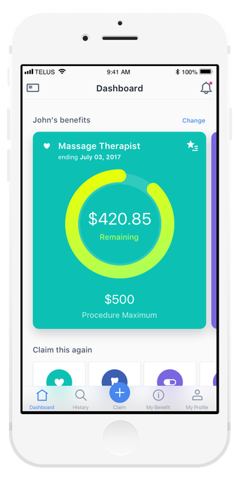
Quickly see remaining balances for frequently used procedures
Increase engagement with the app on a daily basis to serve information that matters most to the user.
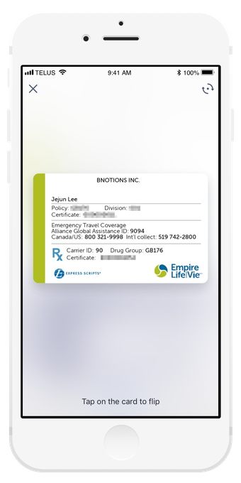
Digital copy of your benefits card
To minimize user effort, we focused the experience to surface information when the user needs it most.
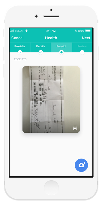
Take a photo of your receipt for easy submission
Using a mobile camera, submit multiple procedures on a single receipt.
Creating an engaging experience
We designed with consumer delight in mind, using micro-interactions and animations to make things like claims submissions more exciting.
The right information at the right time
During claim submission, we are serving the right information when it’s needed like: balance you have left on the procedure you’ve selected.
Even small things count
We used subtle visual cues and interactions to help users through experiences that can be frustrating, like finding the right numbers on a cheque for direct deposit.
Results
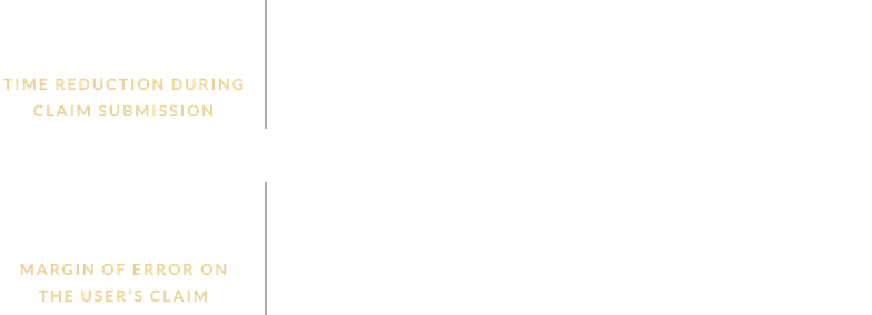
Symbility Health and 5 other companies launched the same app on the same day with their own branding. The analytics results were showing:
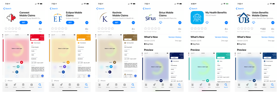
Symbility Health was acquired by Telus Health on May 8th, 2018. The app and its ability to be white-labeled was the most significant factor for the acquisition.